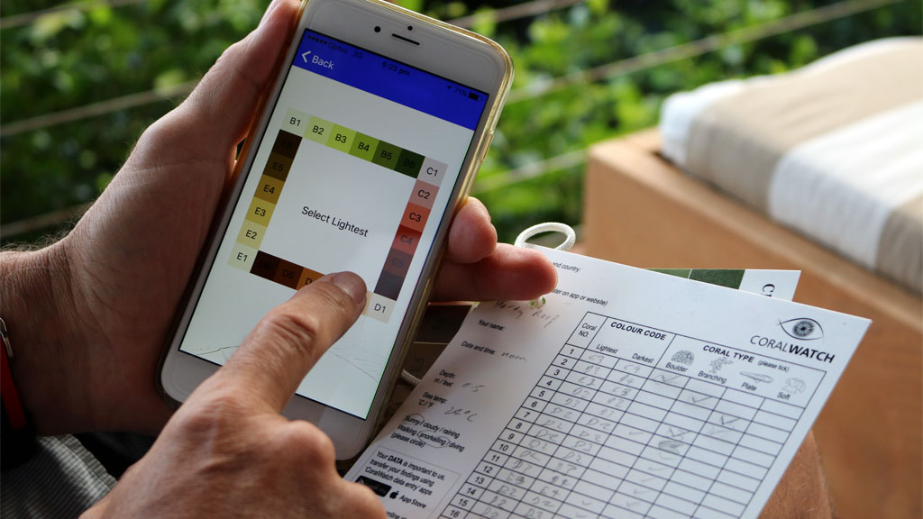
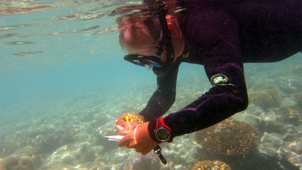
CoralWatch is a citizen science initiative to help non-scientist volunteers (like me! And you!) collect valuable data about the health of our coral reefs. We decided to find out how easy it is to complete a CoralWatch survey on our last visit to the Whitsundays – in the heart of the Great Barrier Reef.
How does it work?
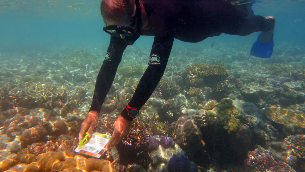
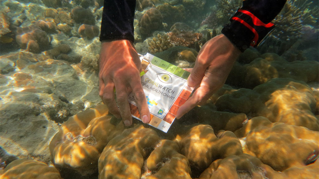
Using the colour coded Coral Health Chart, you simply match the colour of corals and enter them on the slate which is part of the Do It Yourself Kit. Then, back on the surface, you enter your data straight from the slate into the free App, via the Web, or send your completed data entry form back to CoralWatch.
We give it a go
The Cruise Whitsundays ReefWorld platform is located on the edge of Hardy Reef about 40kms from the Whitsunday Islands. There are dive sites along the reef edge either side of the platform, and plenty of snorkelling as the top of the reef is very close to the surface.
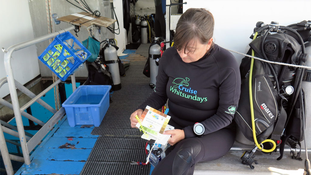
We tested the slate underwater on a dive first. You don’t need to be a coral expert to use the Health Chart: only be able to identify four different types of corals: Branching, Boulder, Plate or Soft. The Health Chart is easy to use as long as you have good buoyancy control, (and below 6m you need a torch to ensure you get an accurate colour match), and it helps to rig up a pencil with a short string before you start.
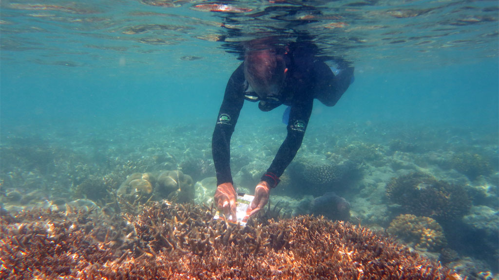
We also tried the slate snorkelling along the edge of the reef, and found that this is even easier as the natural light makes it quick and easy to establish the colour match. For each coral head, we simply record the lightest colour and the darkest colour, and then move on to the next random piece of coral. Two fins kicks following a straight line along a reef edge gave us a great random sample. It took just 10 minutes to complete a survey of 20 readings.
The App obviously requires a connection to the Internet to log in and update load, so we decided to wait until we got back to the comfort of our hotel in Airlie Beach to enter the survey. The Data Entry using the App is very quick because it’s graphical – you don’t need to key in the letters and numbers, B2, E3 etc, you just tap the corresponding colour on the App screen.
Our verdict: the Chart and slate are very easy to use. It’s actually more fun to do the survey as a snorkel – though it would have been a good use of a safety stop – if we’d had a flat reef (rather than steeply sloping wall) at the appropriate depth.
Why is the data so valuable?
With increasing global ocean warming, coral bleaching is becoming increasingly prevalent. However, coral bleaching doesn’t necessarily result in coral death. By identifying areas where corals are susceptible to bleaching, it might be possible to improve the chances of coral recovery post-bleaching if some of the other stressors can be addressed.
The data accumulated by CoralWatch is made available to academics across the world and can be used to support many different streams of research. Most importantly though, if your survey indicates that there is a >70% likelihood of representing a bleaching event, you will receive and email alert, and you can contact your local reef management group to investigate further.
Get the Chart
If you’d like the Do It Yourself Kit, or even just find out more, head to the CoralWatch.org website where you can order your free Chart, and download most of the information sheets and materials you’ll need.
If you liked this post, you might also like to read about an initiative to Save the Reef called Reef Aid.

